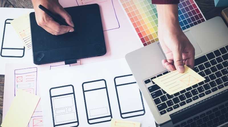
Responsive Website Design Is The Real Future Of Web Designing Industry
With increasing completion in online businesses, it is becoming harder to stand up a great site and get a better response. Thanks to the latest technology and tools that are available for making this happen and to help design your business website in a unique way. A responsive website is designed to capture the ever-growing needs of the jet-set crowd today. It is the most effective tool in reaching out to the audience. Each website should have a responsive web design to cater to the various needs of the clients. A responsive website is meant for all devices – laptops, computers, phones etc. In order to make a mark in this cutthroat competitive world, you have to stand out from the rest. To catch the attention in this crowd would be to make something simple enough to be understood very easily, yet get your communication across.
The conception of Responsive website
A responsive website was conceptualized by Ethan Marcotte. According to him, responsive website design is not one whole design, but a series of technology joined together. As the screens are widening and high-resolution screens are becoming more prevalent, the layout of the website design has gained momentum. The layout has to be striking enough to capture the imagination of the reader in a few moments, yet it has to fit beautifully in any screen.
Features of a responsive website
The first and foremost thing a responsive website should be concerned about is the layout. The layout will have a simple design to provide the readers with an easy viewing experience. The layout should have a fluid experience, easy to view in any platform – laptop, phone or anywhere else. It would not have any panning, scrolling or resizing to give it a seamless look. The look will have flexible pictures, proportion-based grids, and CSS3 media queries. The layout of the website should be such that even if it is compressed or widened, the layout will adjust itself according to the size without any hitches.
Components of Responsive website
The fluid Grid is one of the most essential components of a responsive website. It is the ability of the website to merge in with any surroundings. The pixel design is fixed in this technique and is usually placed in the centre of the page. The proportion in such a case is designed carefully so that it can seam in well with a small-sized screen of the mobile phone as well as a large-sized screen on the computer. The pixel size has to be proportionate in any screen. The target element has to be divided by the context in order to attain the perfect proportion size of a page. Photoshop can be used to get the high-fidelity mockup. With this, the page element can be measured and divided by the width. If the number arrived at is not a perfect number, don’t round it off, but leave it as it is for mathematical accounting precision.
A Media query is another important aspect of responsive website designing. It is the technique by which data is collected from the visitors to a website and apply it conditionally on CSS styles. Ideally, the pixel width should be adjusted with every screen width to attain the perfect resolution. While choosing a resolution, your own discretion and judgment should be applied as it would depend on many factors – namely, budget, time, context etc. It is best to stick to a standard size resolution as more resolution will take up more time.
Responsive website design is user-friendly and is the future of website designing, as it can adapt itself to any changing screen. A lot of websites have changed their website thus and if you wish to design your website in such a manner, you can take the help of some good online a viewed it clearly. The information too is neatly arranged so that it can be accessed by the viewer very easily. In this fast-paced world, where everybody is rushing, the information has to be given at the click of the mouse and the viewer will not have to search for it. The pixels in this case are arranged in such a manner as to give a crystal clear view of the image in any screen, thus enhancing the experience of the viewer. Therefore, this website technique is especially beneficial for creative designers as it will enhance their creativity further.
You have to expand your horizon of the thinking process to achieve perfection in this technique, as a high dose of imagination is required for designing such a website. The layout should be simple enough to pop up within some moments of opening the website and frills should be kept to a bare minimum. The website should convey the message in simple, quick steps. When a website is viewed on a desktop, a mouse is used, while on a phone, usually, the fingers work, so the website has to take this into consideration. Graphics may be altered according to the usage, on mobile phones the graphics should be small while in larger-sized screen desktops, and there can be bigger ads.
Every business needs to be on responsive website designing as a large chunk of internet users are accessing the internet on their phones, so everything needs to be customized for phone internet users. Bloggers should change their mode of communication and replace it with responsive website design. As the target of a website is to reach out to as many audiences as possible, unless they replace their layout designing with responsive website designing, it is hard to attract the majority, who are mobile users. The website has been made to instantly connect with the audience to attract traffic.